The Good News of COVID-19 Is Sticking, for Now
Every major pandemic indicator has been falling for weeks.
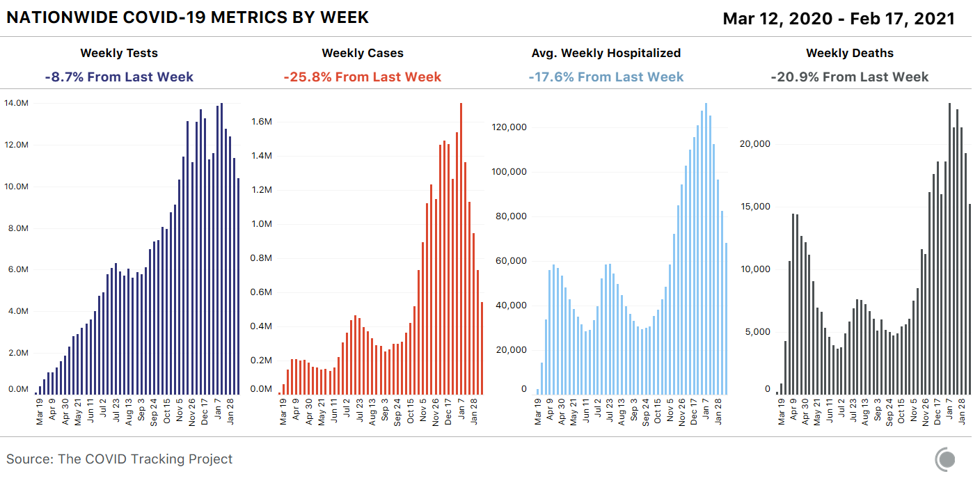
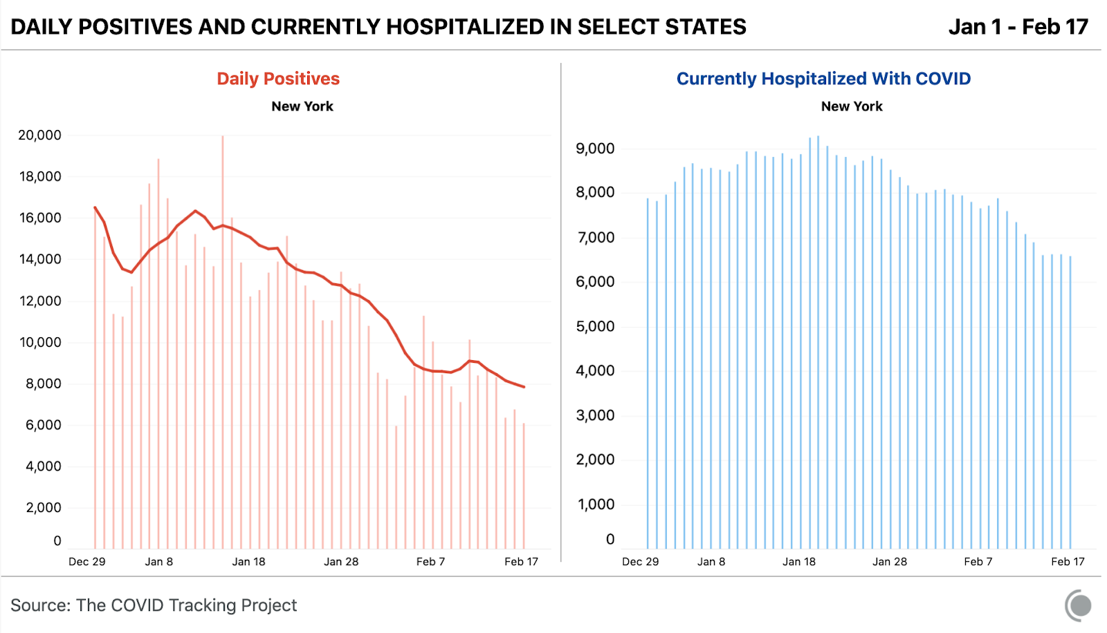
All major indicators of COVID-19 transmission in the United States continue to fall rapidly. Weekly new cases have fallen from 1.7 million at the national peak in early January to fewer than 600,000 this week, and cases have declined in every state. As we’ve seen at many points in the pandemic, case numbers are changing most quickly, with hospitalizations and deaths declining after a delay: Cases have been falling sharply for five weeks, hospitalizations for four, and deaths for two. In this week’s numbers from nursing homes and other long-term-care facilities, we are now seeing solid declines in deaths correlated with COVID-19 vaccinations in this most vulnerable population.
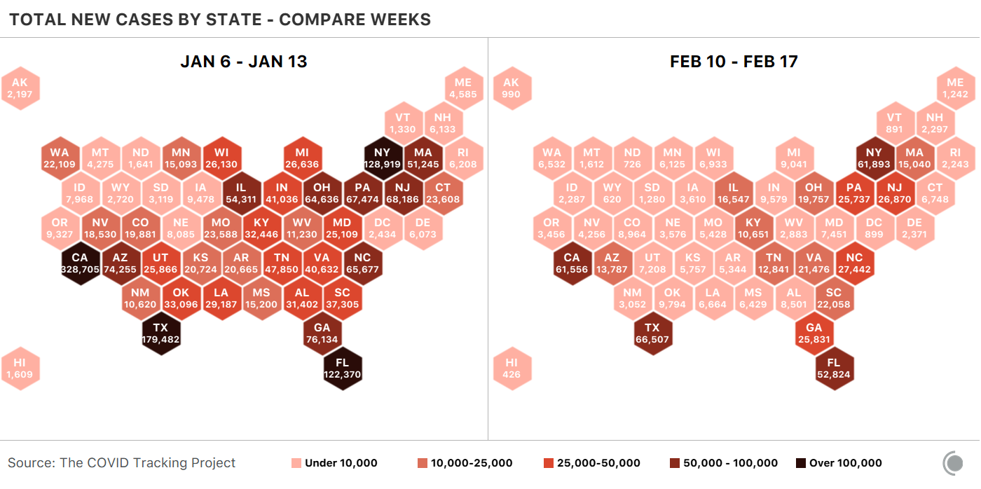
If we look at cartograms of the United States showing weekly new cases for the worst week in January and for the week ending yesterday, the drop in the number of cases in each state is startling. Although states are still reporting large numbers of cases, many more parts of the country show absolute levels much closer to what we saw before the most recent surge accelerated nationally in October.
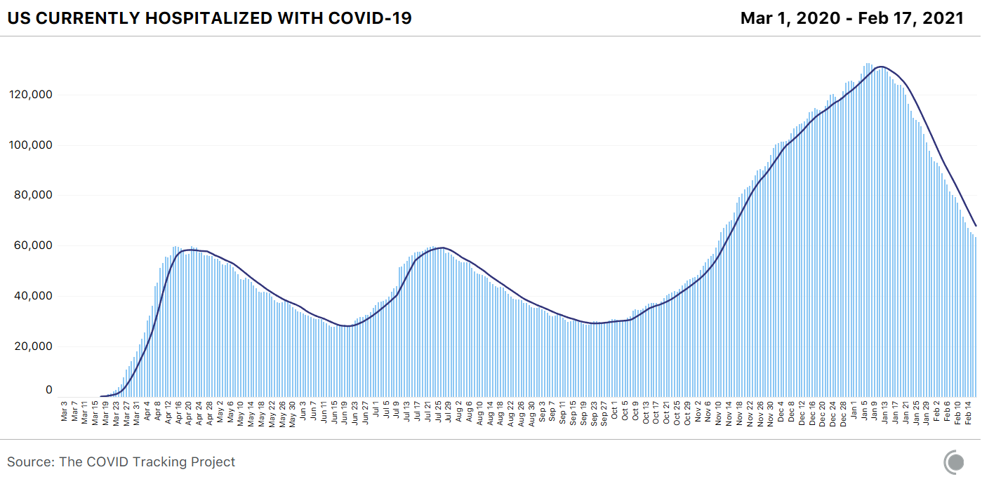
COVID-19 hospitalizations, too, have fallen very sharply. Every region and subregion of the U.S. now shows substantial declines in the number of hospitalized COVID-19 patients.
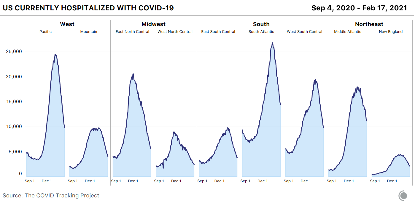
Despite the declines, the total number of people hospitalized is still very high—hospitalizations have yet to fall far enough to reach even the peaks of the two previous surges, which both rose to roughly 60,000 hospitalizations.
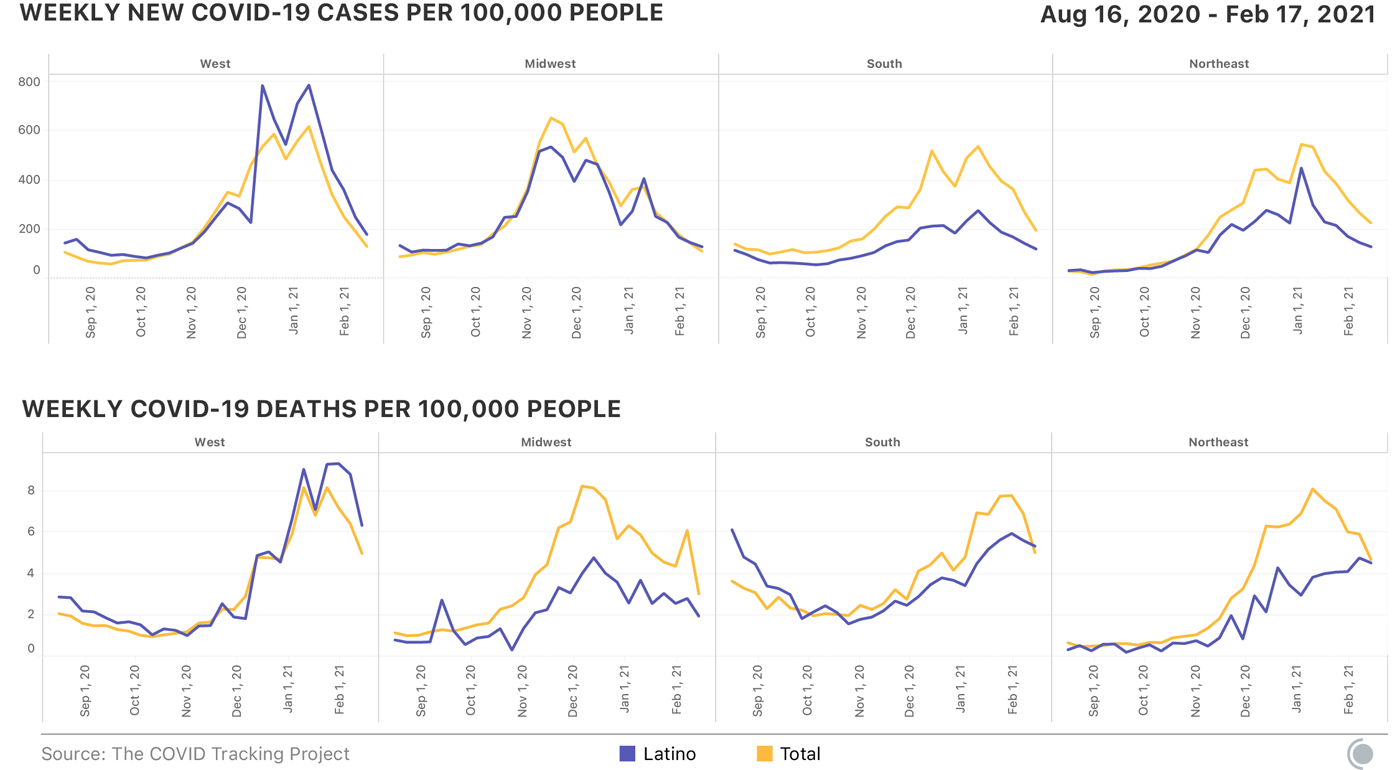
Here’s what we can tell about cases and deaths among Latino people. Throughout the pandemic, the age-adjusted risk of contracting and dying from the coronavirus has been higher for people of color. With the easing of the huge outbreaks in Arizona and California, we reviewed the data states have reported for Latino people, a group that saw disproportionate numbers of cases and deaths in those states. According to CDC data, Latino people have been 1.3 times more likely to be infected and 2.3 times more likely to die throughout the pandemic in the U.S. compared to white people. But the regional story is quite complex: The effects of the pandemic on Latin American populations have shown wide variation from urban Los Angeles to the rural South. In the West this winter, the huge outbreaks in Southern California and Arizona drove a massive spike in deaths among Latino people, but in the Midwest and Northeast, even as deaths rose, Latino deaths did not precisely follow.
The differences by region and demographic group are obscured in the top-line numbers and nationwide comparisons. Better state-level race and ethnicity data continue to be necessary to understand these differences in how the pandemic is playing out.
Vaccines are finally showing up in the data, right where we most want to see them. According to the CDC, more than 16 million Americans have now received two doses of either the Pfizer-BioNTech or Moderna vaccine since late December. At least 1.8 million of these fully immunized people are residents of or staff in nursing homes or other long-term-care facilities, and more than 900,000 of that 1.8 million are residents. More than 4 million residents and staff in long-term-care facilities have received at least one dose of a vaccine.
Like many people, we expected to see the effects of vaccine distribution show up first in long-term-care facilities. But for weeks, we didn’t see much happening in the data. In retrospect, this makes sense: Many of the people dying of COVID-19 who were reported dead in early February probably contracted COVID-19 in December, given the time it takes for the disease to overcome a body’s defenses and the lags in data-reporting pipelines. As each week passed, we watched and waited to see a clear signal that all those first and second doses were having an effect.
During the clinical trials, all of the front-runner COVID-19 vaccines were 100 percent effective at preventing hospitalizations and deaths, even among the oldest participants. In the past two weeks, preliminary (not yet peer-reviewed) real-world data have started to come in, most recently from Israel, showing similar effectiveness in preventing severe illness and even reducing viral load—a finding that could indicate reduced viral transmission. During yesterday’s White House press briefing, Anthony Fauci noted that this research has “very important implications from a public-health standpoint for interfering and diminishing the dynamics of the outbreak.”
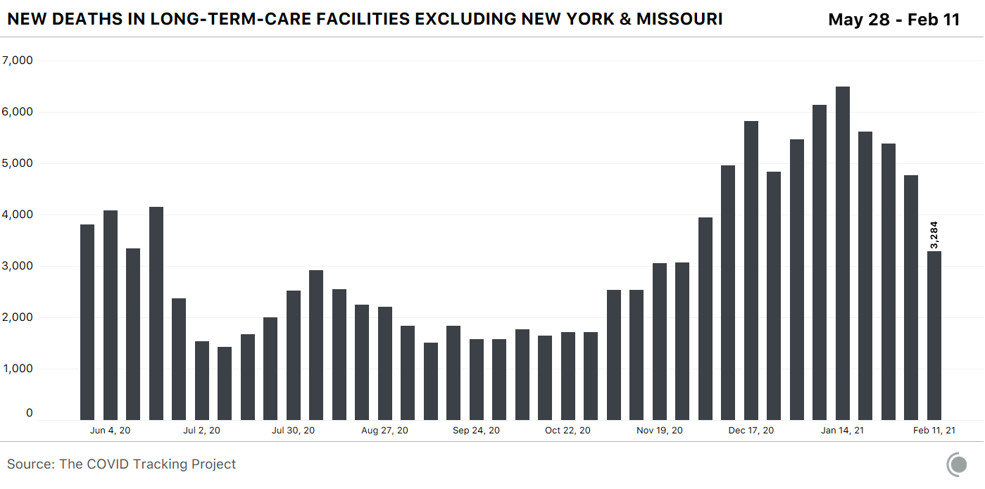
Now, with the data through February 11, the shift is clear: Deaths are falling in long-term-care facilities. Cases, too, have plummeted. As important, deaths in these facilities are declining not just in absolute numbers, but as a share of COVID-19 deaths in the whole country. In early January, the percentage of COVID-19 deaths associated with outbreaks in long-term-care facilities decreased below 30 percent for the first time since we began collecting LTC data, in May, and it has continued to decrease since. This change correlates strongly with mass vaccinations in these facilities.
First, the absolute numbers: Excluding data from Missouri and New York—both of which dumped large numbers of undated deaths into their LTC data in the past month, confounding analysis of both their individual states and the national numbers—the number of deaths in long-term-care facilities has fallen 50 percent from the peak of reported deaths in mid-January.
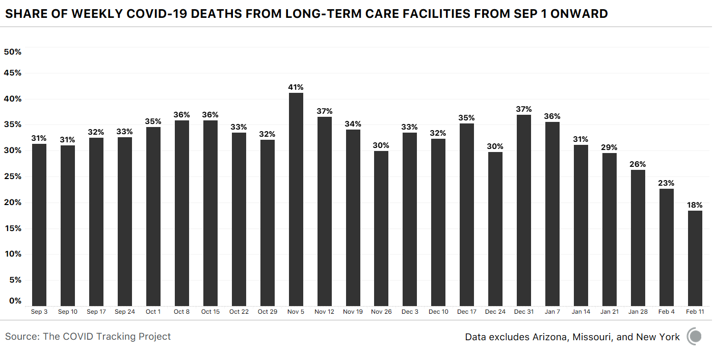
But deaths are clearly falling among all age groups in the U.S., so one could imagine that the declines in long-term-care facilities merely reflect this broader pattern. To test this theory, we looked at the share of deaths that were linked to long-term-care facilities. Remember that these facilities are home to less than 1 percent of the U.S. population. For months, the share of deaths linked to long-term-care facilities bounced between 30 and 40 percent. In mid-January, it was still 29 percent. Then, over the past three weeks, the share of deaths associated with LTC outbreaks began to decline.
For the week ending February 11, long-term-care-linked deaths represented just 18 percent of total reported deaths in the states where we have these data. One way to think about this is that the share of deaths associated with long-term-care facilities has been cut in half since early January.
Cause and effect have been very difficult to establish in the United States throughout the pandemic. Our national patchwork of data sets and policies has confounded many simple analyses that try to explain why cases or deaths are rising or falling. But this week, we have clear evidence that the vaccines are saving lives in exactly the places where we would expect to see their effects show up first. We are—at long last and after so many failures—beginning to protect the most vulnerable.
This week, in Texas, a major crisis has unfolded. Record-cold temperatures locked up the state’s energy infrastructure, causing huge power outages. Local news reports suggest that this slowed or stopped vaccination distribution and administration in many parts of the state. Testing sites were also closed in some areas, like Hidalgo County.
It’s not just operations but also reporting that can be disrupted. Over the past year, we’ve seen that major storms can cause significant problems with the COVID-19 data that states report. Sometimes, these problems are easy to spot. A state will simply outright say: We cannot post data today. Other times, the wobbles a storm introduces into the data are not as visible.
If people are having trouble moving around a city because of a storm, they are also less likely to seek out testing or even seek medical attention. Because authorities are still able to report something, the interruption is not immediately obvious. As we noted in last week’s update, the early-February snowstorm in New York created data disruptions that artificially depressed COVID-19 statistics for several days. Then, a week later, with normal data pipelines, the seven-day average bounced upward, making it seem as if the decline in tests and cases had reversed. But that was not the case in reality.
There are more important issues in the state of Texas right now, but it would not be surprising to see a similar dip and then rebound over the next couple of weeks. With alarm about the variants of concern running high, we caution that it might be difficult to distinguish a data artifact from a fast-moving outbreak with just a week of data.
Mandy Brown, Artis Curiskis, Alice Goldfarb, Erin Kissane, Alexis Madrigal, Kara Oehler, Jessica Malaty Rivera, and Peter Walker contributed to this article.
The Atlantic’s COVID-19 coverage is supported by grants from the Chan Zuckerberg Initiative and the Robert Wood Johnson Foundation.