The Winter Surge Is Melting Away
Coronavirus cases, hospitalizations, and deaths all fell for the fourth consecutive week.
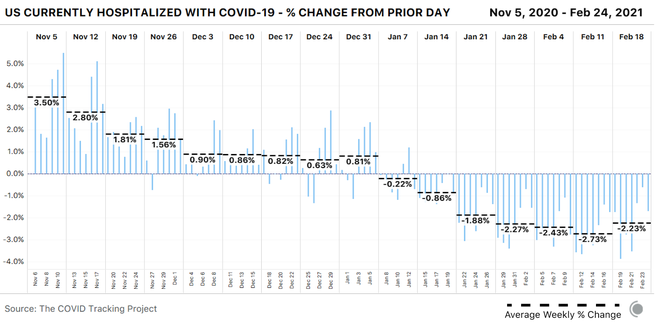
All major indicators of COVID-19 transmission in the United States continued to fall this week. Nationally, cases have been falling for six weeks, hospitalizations have been dropping sharply for five weeks, and deaths have been declining for four weeks. The average number of people in the hospital with COVID-19 this week was just under the average we saw during the high points of the April and July hospitalization surges. States and territories reported 14,463 COVID-19 deaths in the past seven days, the first weekly total under 15,000 we’ve seen so far in 2021.
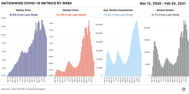
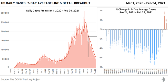
The decline in cases and deaths appears to have slowed this week. After so many weeks of very rapid improvements in reported cases and deaths, a slowing of those declines was inevitable. But we don’t think that a true plateau is the only or even likeliest explanation for what we’re seeing this week. Instead, we think we’re once again seeing the equivalent of a holiday-reporting effect.
Two confounding events that occurred last week—Presidents’ Day and the beginning of a major winter storm that knocked out power for millions of Americans—resulted in slowdowns in case reporting. As we’ve seen with other holidays and storms, these kinds of disruptions produce a predictable series of reporting artifacts: first an artificial drop, then an artificial rise. We should always look for confounding factors before interpreting the data as suggesting a change in the direction of the pandemic—and in this week’s data, we found them. Artificially low numbers from last week’s disruptions make this week’s case and death declines look smaller by contrast, and make the daily numbers look as though they’re reversing direction, especially as backlogs roll in.
The death-reporting process was also affected by the federal holiday and the storm, producing similar artifacts in the data. Even hospitalization numbers appear to have wobbled in a similar way, probably as a result of both small reductions in reporting and small reductions in the number of people who sought care at hospitals over the three-day weekend and during major regional storms.
We’ve also seen large numbers of deaths from much earlier periods reported this month, including a backlog of more than 1,500 deaths in Indiana reported on February 4, nearly 4,500 old but previously unreported deaths in Ohio reported from February 11 to 13, plus a smaller addition of deaths in Virginia (total size still unknown), which the state notes is due to processing death certificates from the postholiday (January) surge.
This brings us to a crucial point that news summaries frequently get wrong: The deaths that states and territories report on a given day do not represent people who died on that day. Reported deaths lag behind cases by two to three weeks on average, and many reported deaths actually took place substantially earlier. When reported cases rose during previous surges, deaths lagged weeks behind. The same is true now, as cases decline.
Why this matters: We have every reason to believe that far fewer people actually died of COVID-19 this week than in previous weeks, because cases and hospitalizations continue to drop. But we won’t see those smaller death numbers for weeks to come—probably for more than two or three weeks, as previously overwhelmed public-health officials are able to catch up on processing death certificates.
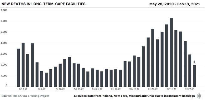
The backlogs in reported deaths have also affected our numbers for nursing homes and other long-term-care facilities: Indiana added 659 historical resident deaths and one staff death to its cumulative total for the week ending February 17, and Ohio added 1,150 historical resident deaths. We can chart a national trajectory of deaths in long-term-care facilities despite these and other recent large additions by working with the data from the 52 jurisdictions that have not included major backlogs or reassignments in recent months.
The resulting visualization is an incomplete representation of deaths in LTC facilities in absolute numbers, but it allows us to understand the national trend: Weekly deaths in long-term-care facilities continue to decline.
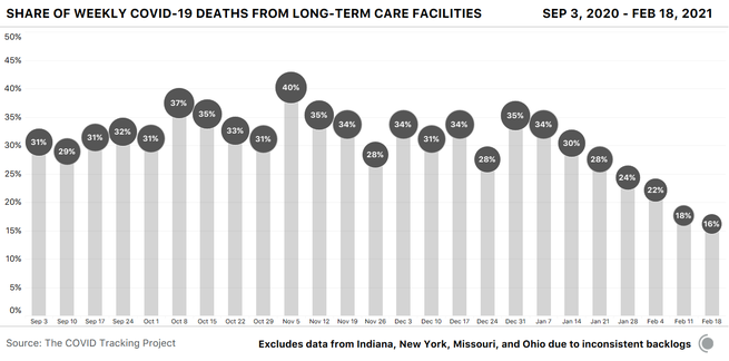
If we view deaths in long-term-care facilities in these 52 jurisdictions as a share of COVID-19 deaths in the U.S., we see that the percentage of the country’s COVID-19 deaths that are occurring in these facilities also continues to decline.
The New York Times also recently analyzed trends in nursing-home cases and deaths in relation to national case and death figures.
When our project ceases data compilation on March 7, the only comparable, public federal data set will be the CDC/Centers for Medicare and Medicaid Services data set on COVID-19—which is only partially comparable, as it includes only nursing homes and not other long-term-care facilities, such as assisted-living and independent-living facilities. These nursing-home data have been reported weekly by facilities to CMS since May 17 through the CDC’s National Healthcare Safety Network. Cases and deaths are reported as cumulative and weekly totals, and some facilities include cumulative data dating back to January 1, 2020. We’ll be writing more about that in next week’s additions to our series of trainings on federal COVID-19 data.
Although COVID-19 has disproportionately harmed Black, Latino, and Indigenous people in many areas of the U.S., it appears that vaccinations are not being proportionately administered to many of these communities. The Verge visualized vaccine administration in Chicago, New York City, and Washington, D.C., and found substantial mismatches between areas with the highest case or death rates and areas with the highest vaccine administration. A Los Angeles Times investigation likewise found that the areas hardest hit by COVID-19 in and around Los Angeles currently have the lowest vaccination rates. Inequities in vaccine distribution and administration result from many factors, including inaccessible systems, state-level decisions, fixed age cutoffs, and problems with people actively circumventing the processes established.
Federal vaccine data include race and ethnicity for slightly more than half of all reported doses, but aren’t broken down by state and don’t allow for crucial age-race cross-comparison. Data from the 40 states that publicly report race and ethnicity data for vaccinations, compiled by KFF and others, track vaccinations by race and ethnicity, but most states do not include age breakdowns, and some are missing race and ethnicity data for more than 30 percent of vaccinations. Reporting at the metro level and rough analysis within states have given us plentiful warning that vaccine rollouts are currently missing many of the communities at the greatest risk from COVID-19. Without better data about who has been vaccinated across all U.S. jurisdictions, we will not be able to identify and address the full range of inequities in the rollout.
Mandy Brown, Artis Curiskis, Alice Goldfarb, Erin Kissane, Kara Oehler, Jessica Malaty Rivera, and Peter Walker contributed to this report.
The Atlantic’s COVID-19 coverage is supported by grants from the Chan Zuckerberg Initiative and the Robert Wood Johnson Foundation.